GO VOTE: People’s Flag of Eau Claire Finalists
How do you sum up the spirit or our fair city on a rectangle of cloth? A diverse slate of six finalists think they have the answer, and now local people have an opportunity to select a design for the People’s Flag of Eau Claire. A committee of judges recently winnowed the entries into the project down to six diverse banners, which residents of Eau Claire County can vote on between now and Wednesday, May 31.
The People’s Flag of Eau Claire project is the brainchild of Eau Claire resident C.J. Krueger, who was inspired by a similar effort in Milwaukee as well as a seminal TED Talk by Roman Mars about the pitiful state of municipal flag design. Under the slogan “A great city deserves a great flag,” Krueger’s committee collected entries online. They asked designers to follow basic flag design principles (keeping it simple and using meaningful symbols, for example) while capturing the essence of Eau Claire. Here are the finalists ...
![]()
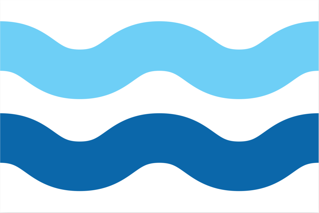
Clear Water Revival by Mike Berge
“I titled this flag Clear Water Revival. Over the last 15 years or so, Eau Claire has had an undercurrent of resurgence and renewal. I wanted to design a flag that captured this revival in true Midwestern modesty with clean lines, negative space, and subtle letters. Despite the seemingly modest design, the message is clear and captivating with EC being the vantage point of the horizon, where the sky meets the river.”
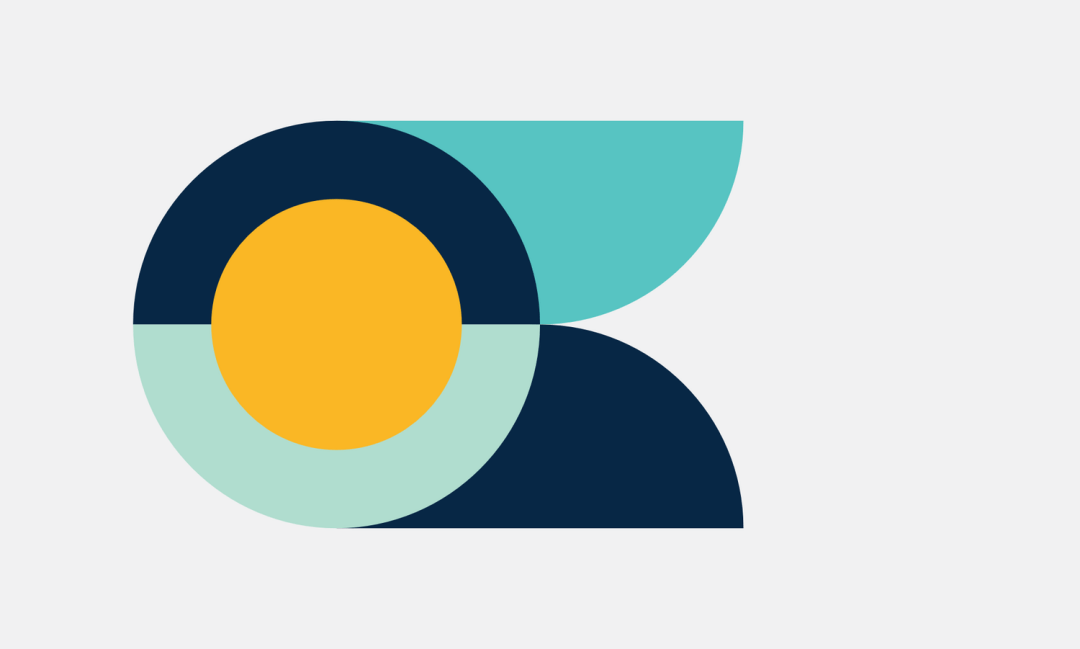
Gathered Waters by Daniel Thiede
“Unified and stately. This design reflects its many sources of fresh water, along with a nod to the People’s Flag of Milwaukee. Its simplicity allows for diverse readings. The color palette was chosen for its watery, blue hues. The golden yellow, which gives a sunny warmth to the design, speaks of the spirit and goodwill of Eau Claire.”
Eaux Courantes by Michael Lundebrek
“Eaux Courantes is French for Running Waters. While the city of Eau Claire’s name translates to ‘Clear Water,’ I wanted to emphasize the beauty and wonder that is derived from the wonderful rivers that make Eau Claire the great city that it has become.”
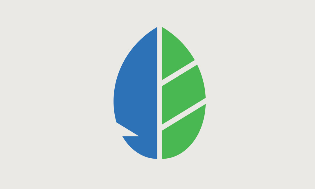
Leaf & Feather by Elle McGee
“The feather represents the abundance of life here, both for our citizens and our wildlife. The leaf represents the many beautiful parks harbored within its borders, and the logging industry which drove our city’s growth in the late 19th century. Blue symbolizes our name’s meaning – “clear water” – and green represents our many parks.”

Radiant River Valley by Danielle Gruber
“This design represents the beautiful landscape and the wonderful connection residents and visitors have with nature. The blue areas come together to form a valley and river – representing the Chippewa Valley and the rivers that run through town. The blue colors represent the pure, clean water our town’s name is defined by. There are so many things to do that take advantage of the outdoors – numerous trails, rivers and lakes, sand volleyball, beautiful golf courses, plenty of winter activities, etc. – so I found a simple yet creative way to represent that.”

Of Water & Woods by Jessica Miller
“The green shape represents a tree. The white space in the middle is that tree in the winter, covered in snow. The jagged lines can also be interpreted as the teeth of a saw blade, referring to the lumber industry of the early Eau Claire days. The light blue line symbolizes water, as “clair/claire” in French means both “clear” and “light-colored.” This flag represents Eau Claire in different seasons, highlighting our city as a multifaceted entity with nature at its core.”
VOTE ONLINE!
To learn more about the entries and to vote, visit eauclaireflag.org
